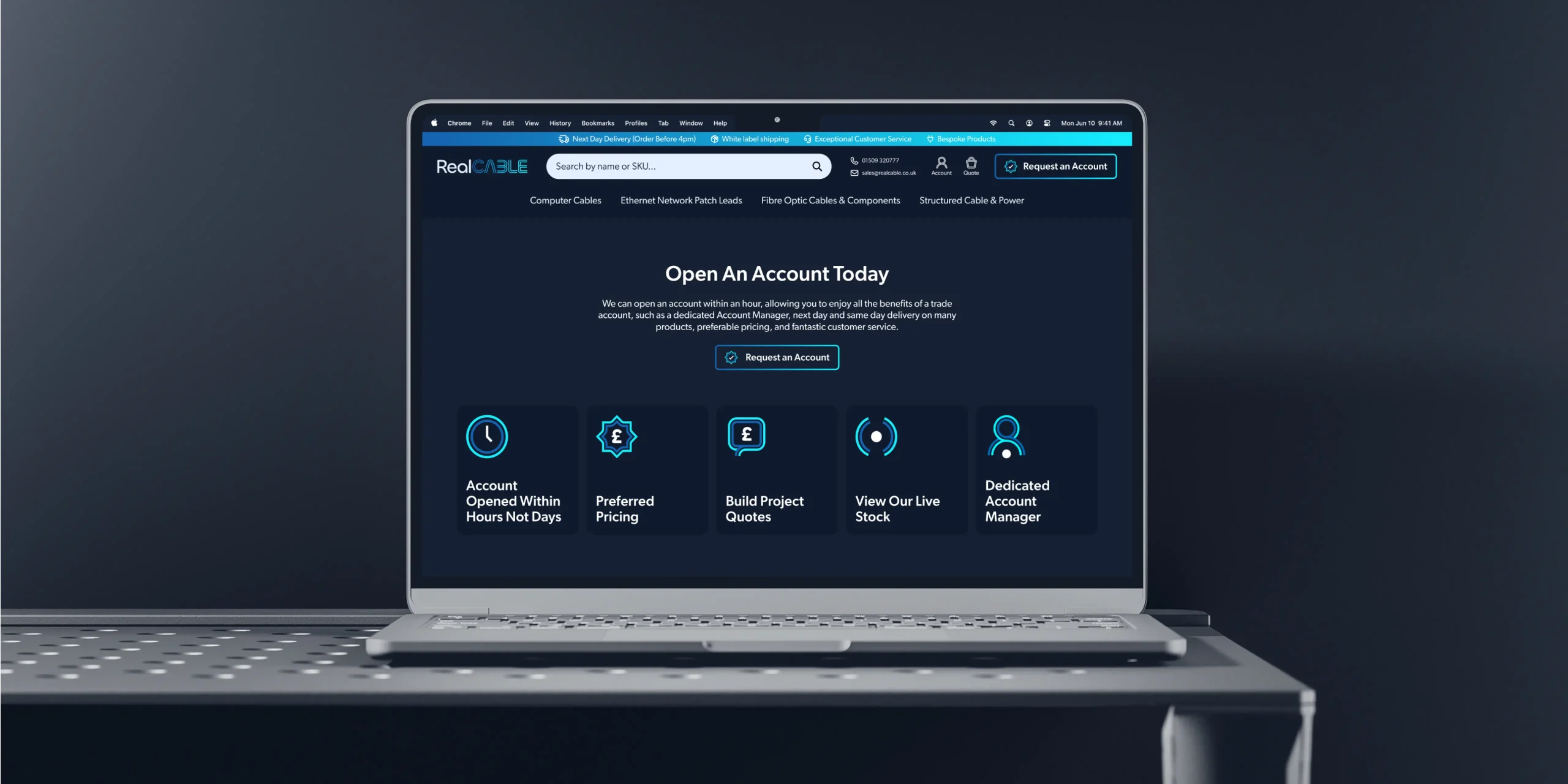
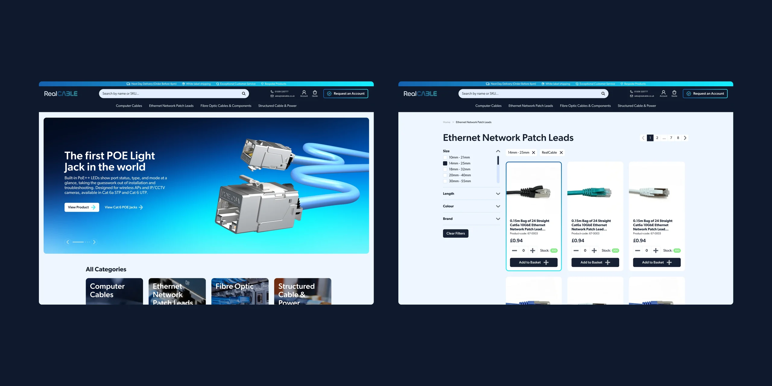
An e-commerce site runs on small functional pieces: account, basket, search, stock, delivery, location. Off-the-shelf icons would have done the job, and they would have been the one part of the site that belonged to nobody.
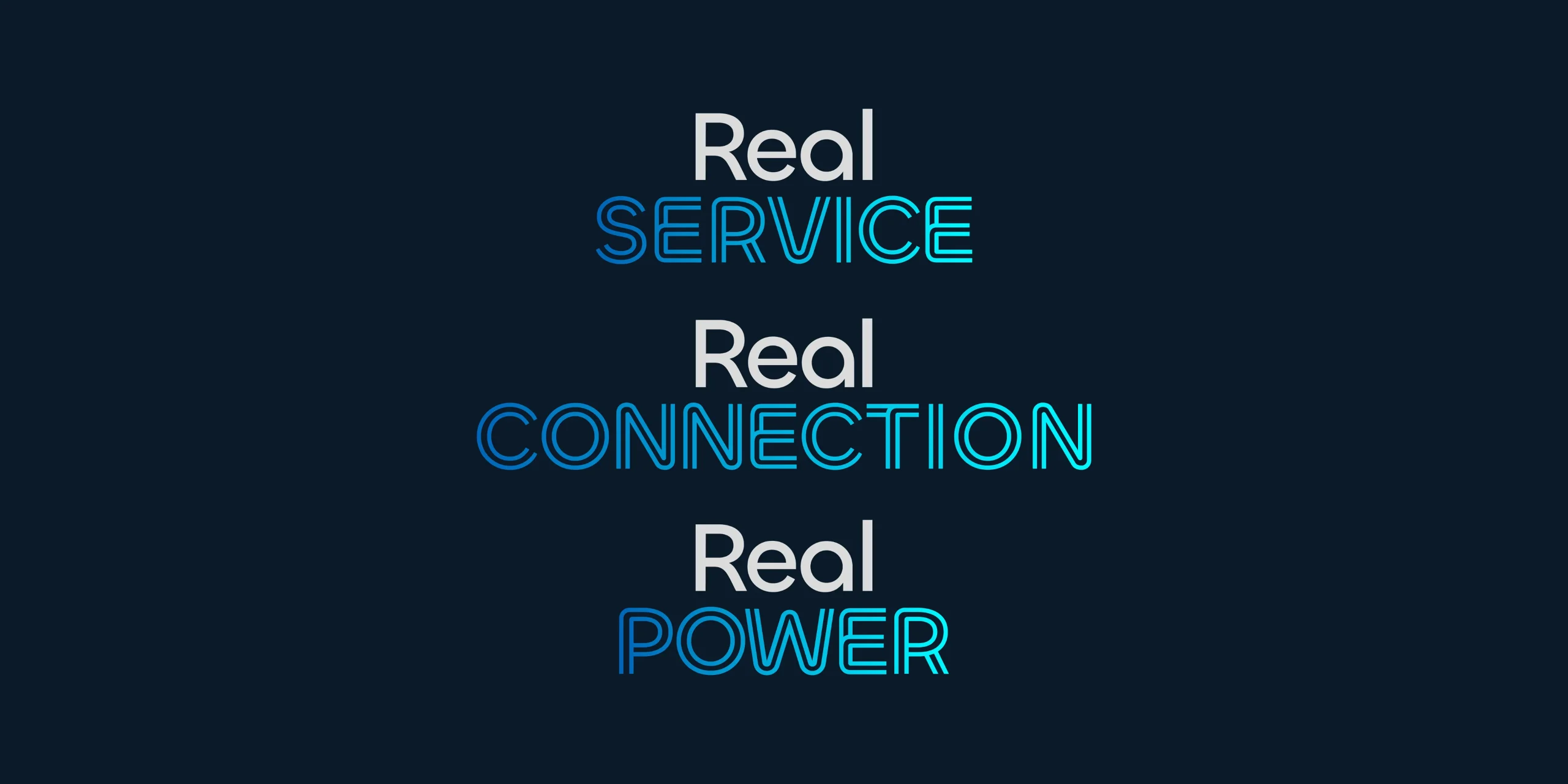
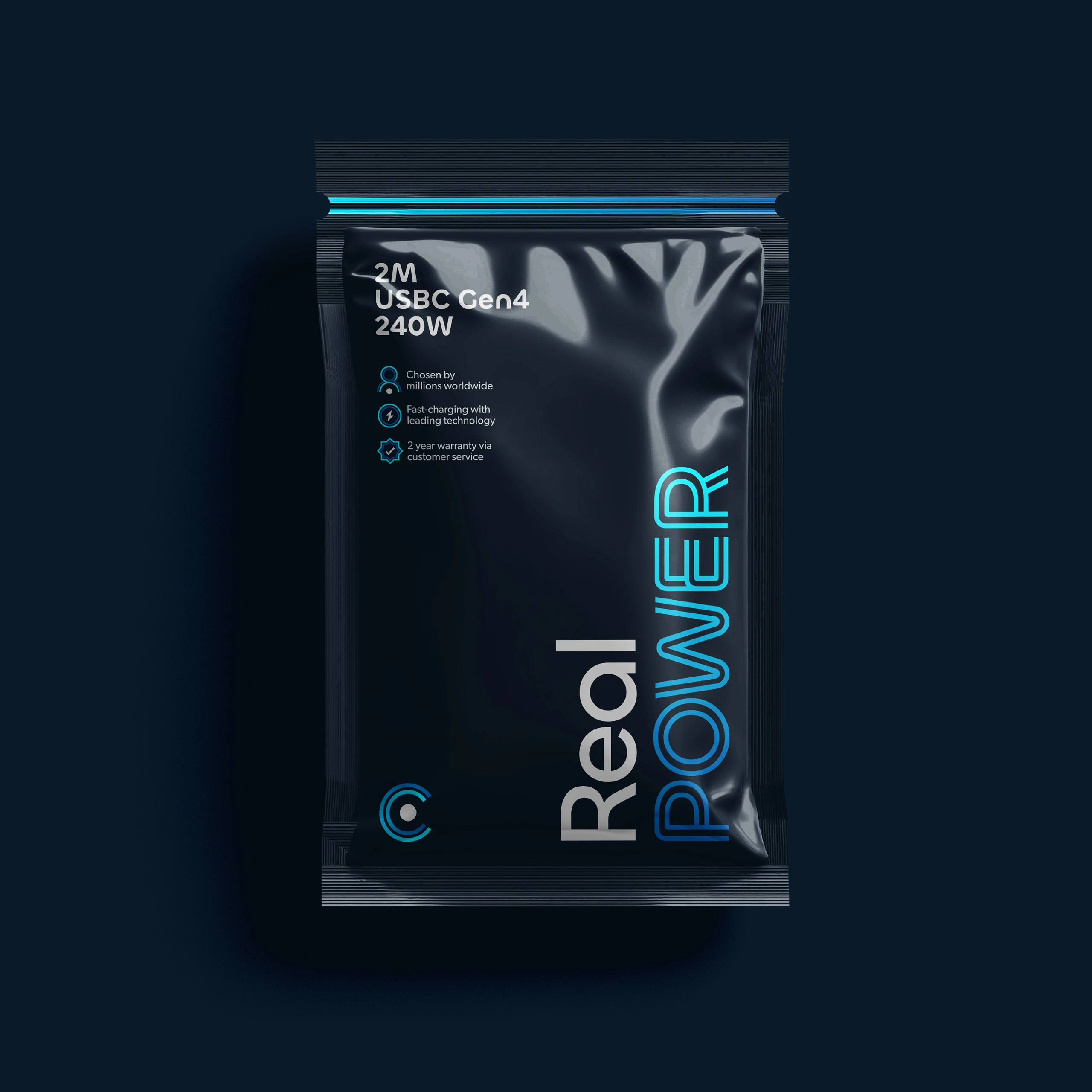
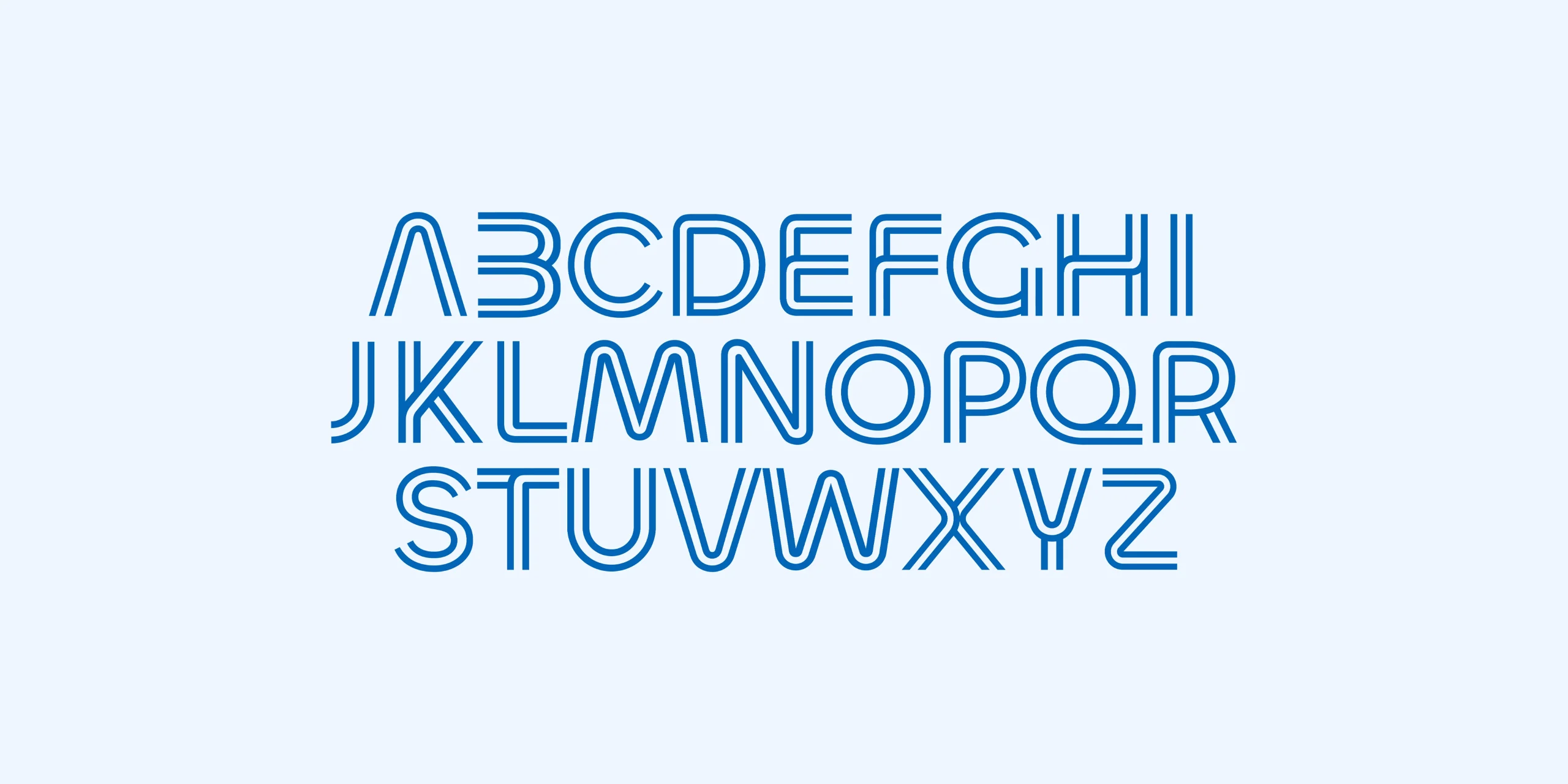
So we drew the set ourselves, using the same twin-line construction as the typeface. The arrows, ticks and plus signs are built from a continuous run that turns corners, the way the letters do. They work across the website and the packaging, which means the benefit icons on a Real POWER pack and the icons in the account area are the same family. Small detail, but it’s the sort of thing that makes a young brand feel settled.