Building a brand-new cabling supplier from the ground up.

Few partnerships come full circle like this one. We’ve worked with Peter Pearson for years, so when he decided to start a new business with RealCABLE, a trade-only network cabling supplier, he came back to us. There was no logo, no website and no customers yet, just Peter’s 40 years in the industry and a clear idea of what he wanted to do differently. We built the brand from scratch, then the website, packaging, print, exhibition stand and social channels, all in time for launch.

Key Highlights

  • Brand identity designed from scratch
  • Bespoke typeface and icon set
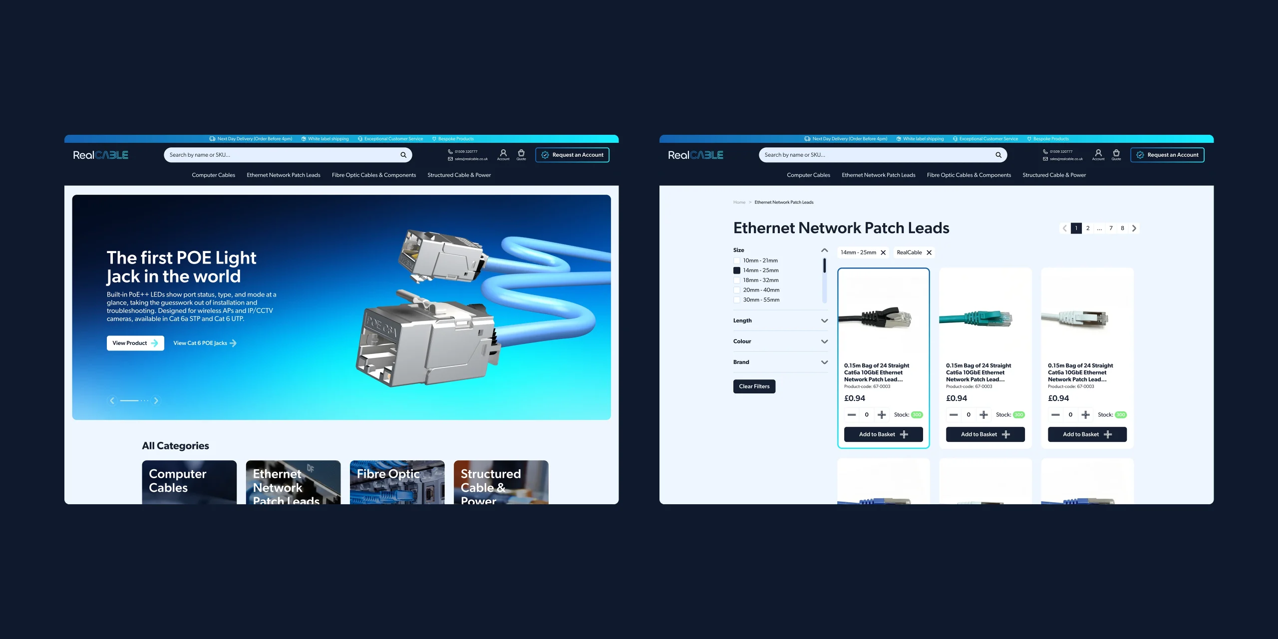
  • Trade e-commerce website with quick account sign-up
  • Packaging, print and exhibition design
  • LinkedIn and social media set up for launch
1,000+ Products online from launch day
1 hour To open a trade account. Most suppliers take days
10 Brand touchpoints, from packaging to LinkedIn
RealCABLE

Brand messaging

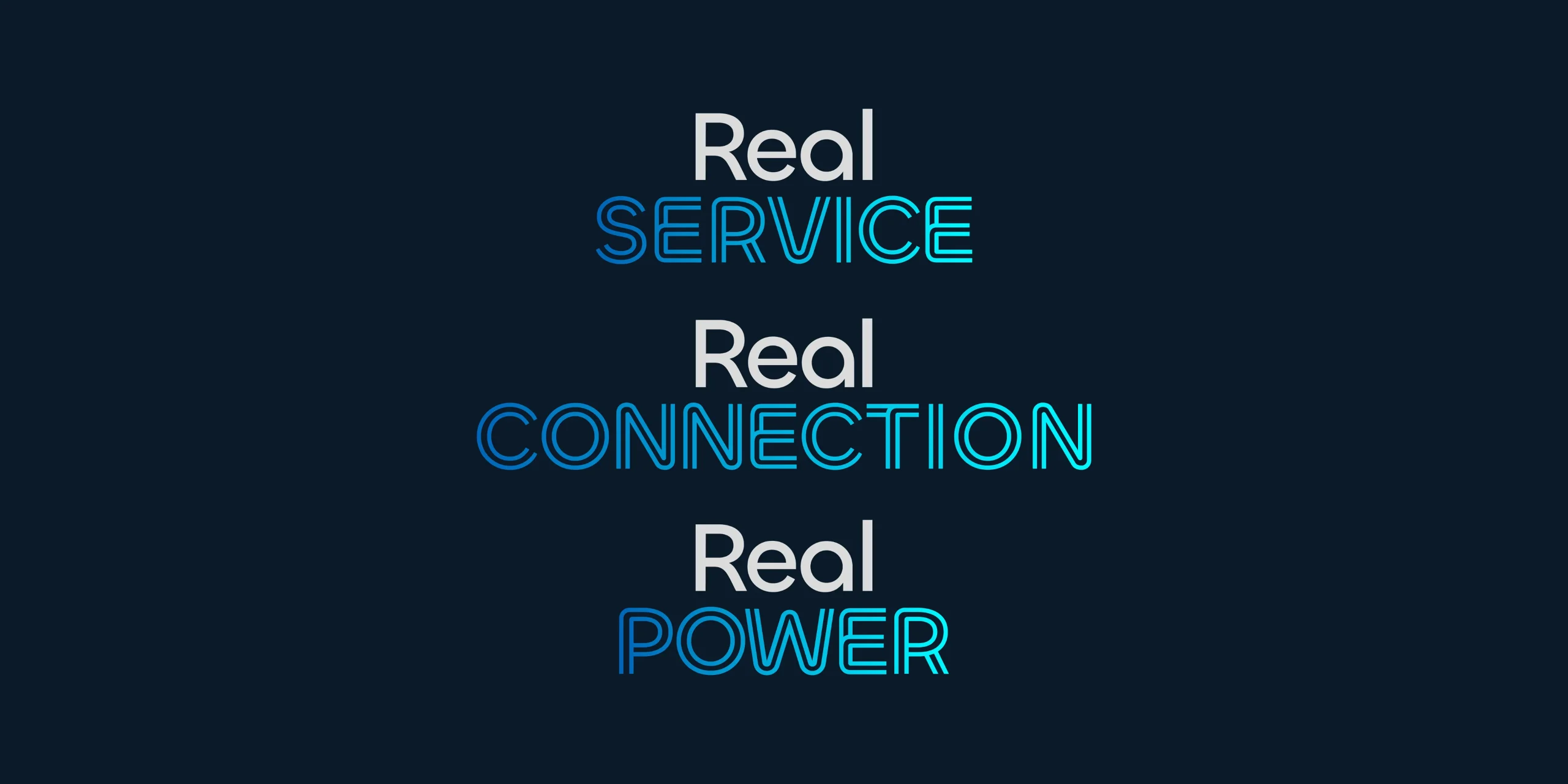
Peter started RealCABLE to fix the things trade buyers had been putting up with: slow account creation, missing stock and nobody owning the problem when something went wrong. We built the messaging around the name, with “Real Service”, “Real Connection” and “Real Power” used as the founding principles RealCABLE stands for.

RealCABLE
RealCABLE

Taking the brand off the screen

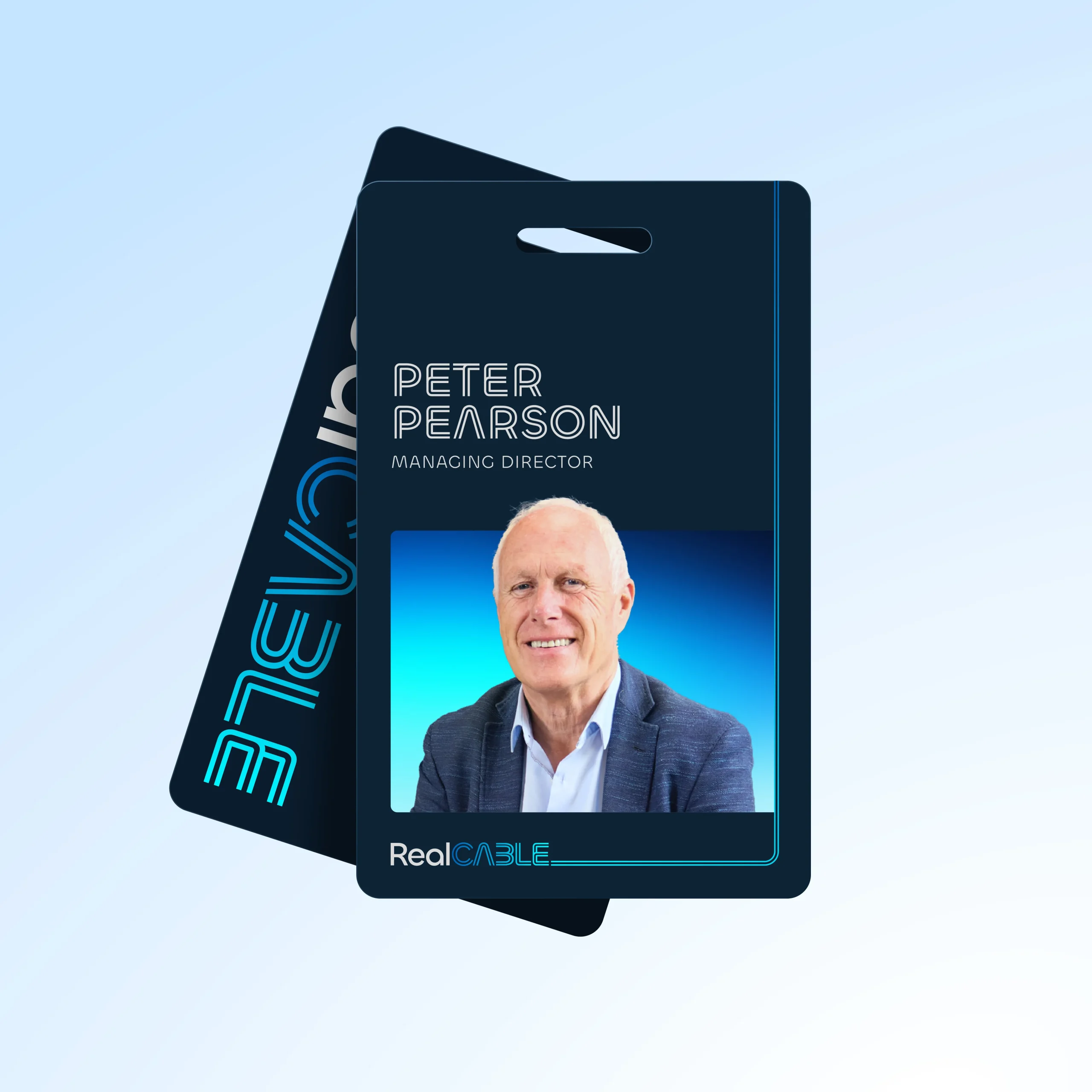
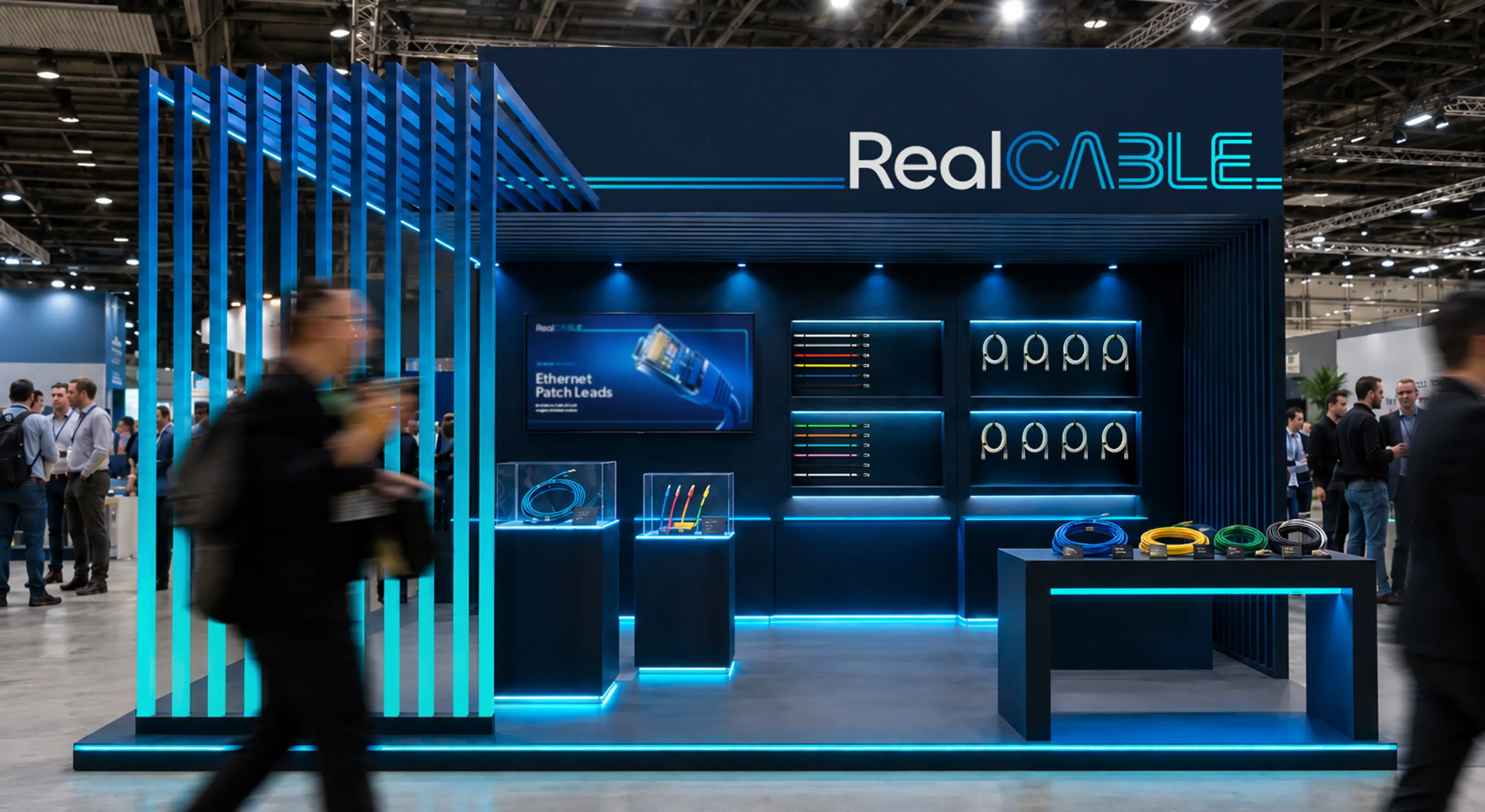
RealCABLE’s team meet customers at trade shows and on site long before most of them reach the website, so the identity had to travel. We applied it across staff ID passes, lanyards and printed stationery, carrying the cable-line rule from the logotype through every piece.

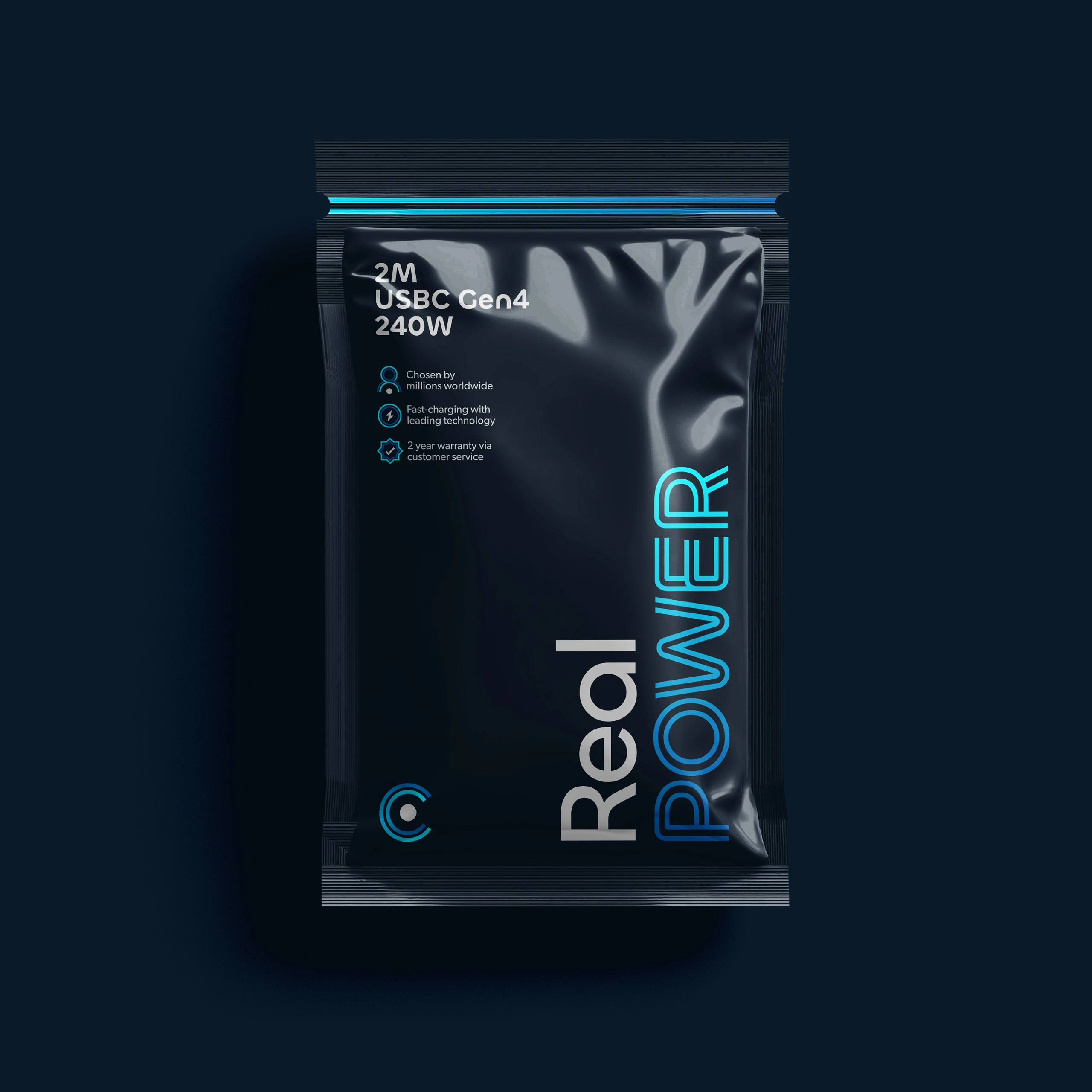
The same thinking runs into the own-brand packaging. Real POWER sits across the range as the line that tells you what’s in the bag. Specifications and key benefits pulled out alongside custom icons so you can see what you are getting at a glance. The result is a brand that holds its shape whether you meet the team in person or open a box at home.

RealCABLE

Built around the conversion

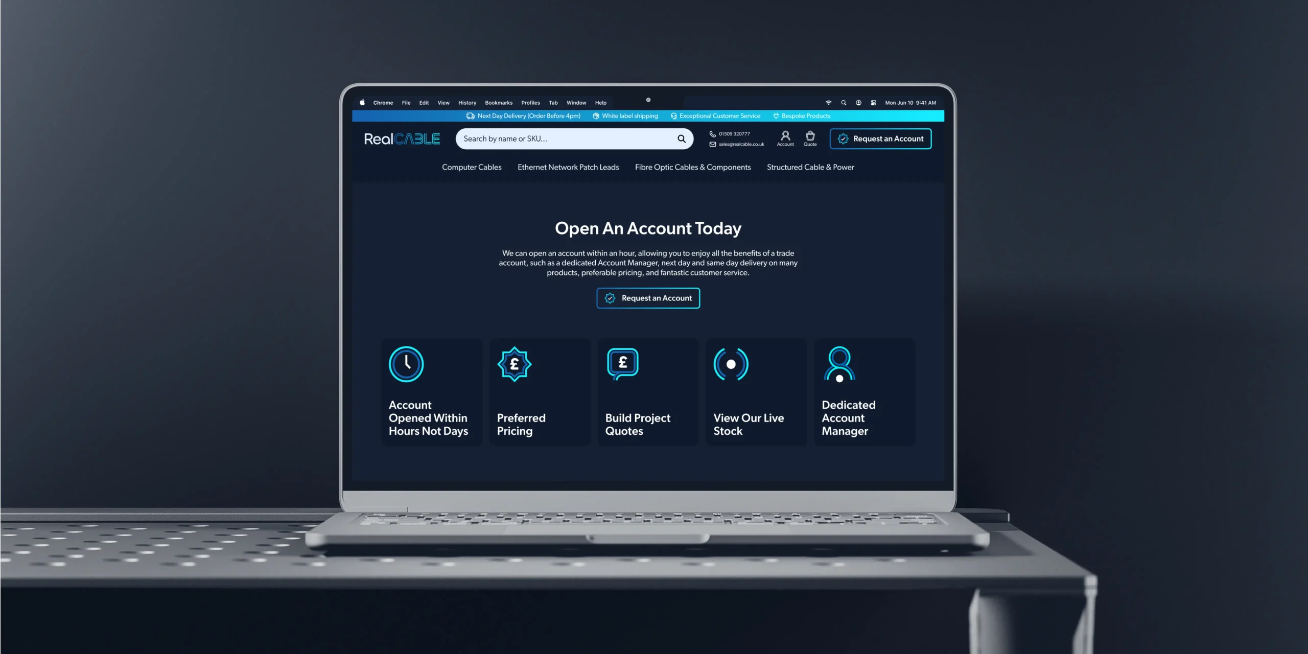
Trade buyers are used to waiting days for an account to be created. It’s one of the biggest complaints in the industry, and RealCABLE can do it inside an hour, so the entire site is built to say so. The homepage leads with the five reasons to open one: creation in hours, preferred pricing, project quotes, live stock and a dedicated account manager. Request an Account sits in the header on every page in its own button styling so that nothing competes with it.

RealCABLE

Finding the right cable, fast

With thousands of products across computer cables, patch leads, fibre and structured cabling, search does most of the heavy lifting on this site. Our search bar in the navigation predicts as you type, so results appear after a few characters and you often get to the product without finishing the word. Buyers can search by name or by product code, which is necessary when someone arrives with a SKU from a spec sheet. From there, filters narrow the results by size, length, colour and brand, and stack together so you can go from a full category to the results that actually fit the job.

RealCABLE
RealCABLE

An icon from the cable itself

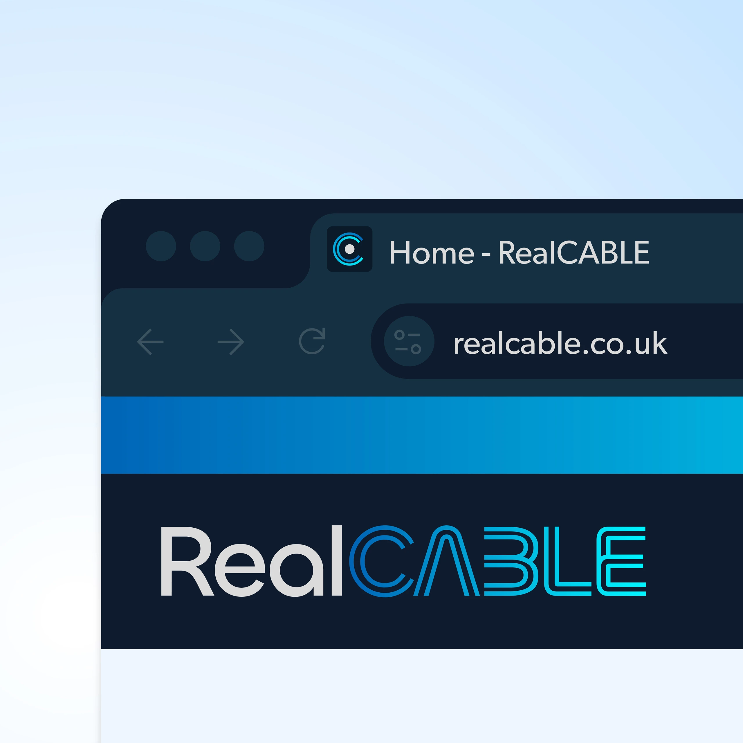
The brand mark is a “C” built from two concentric lines around a centre point, taken from the cross-section of a cable. It carries the same construction as the typeface, so it reads as part of the identity rather than a separate logo, and it holds its shape when it drops to the size of a favicon.

That matters more than it sounds. Most brands get lost in a browser tab or a social profile picture, where there is no room for a wordmark and everything flattens into a blur. The “C” gives RealCABLE something recognisable at any size, so a customer with twelve tabs open can find theirs at a glance.

RealCABLE

A typeface made of cable

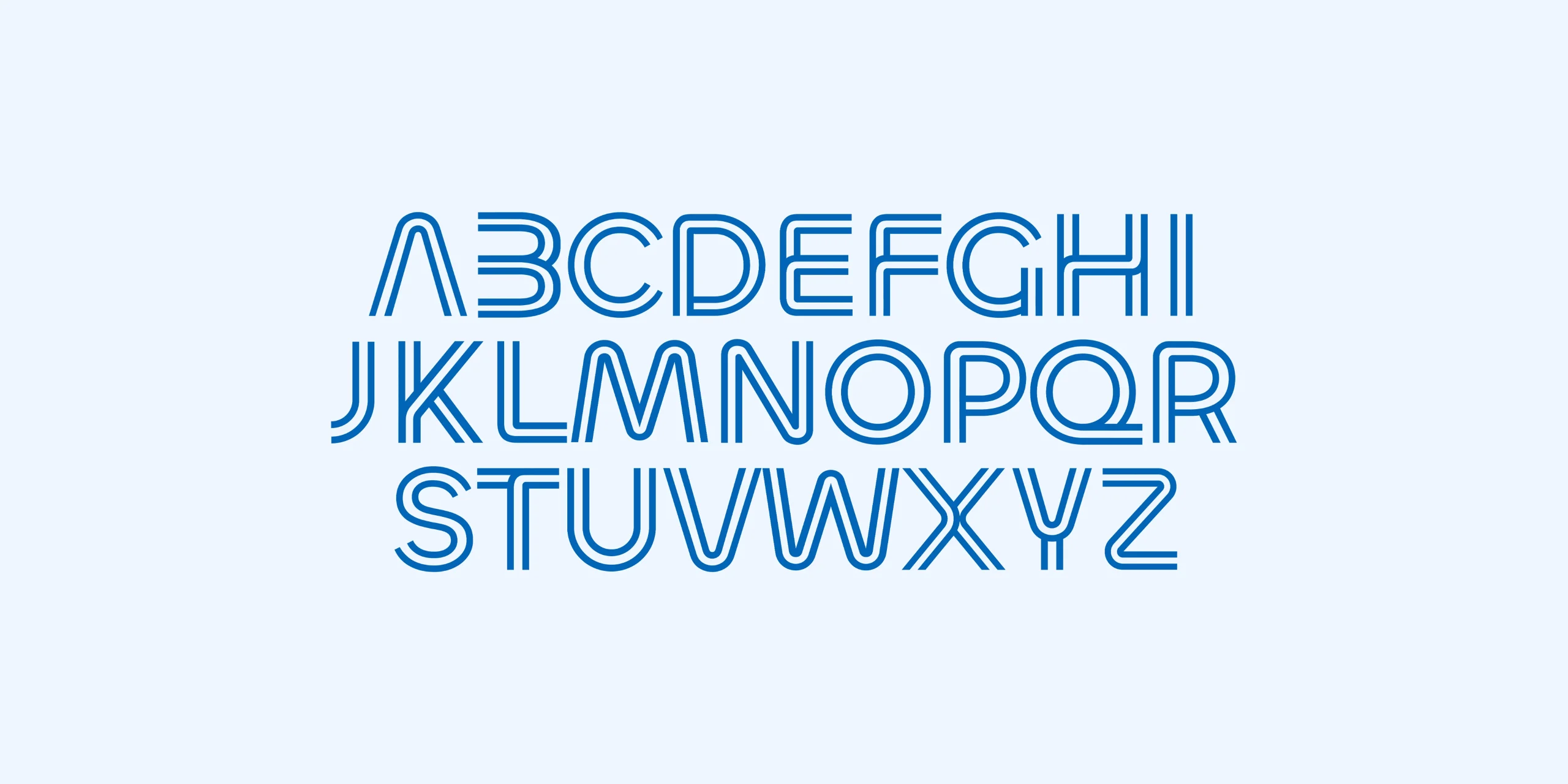
The “CABLE” in the logotype is drawn from twin parallel lines, like two cables running side by side. Rather than leave that idea in the logo, we extended it into a full display alphabet so the brand has its own voice on headings and product names.

Every letter follows the same rule, a single continuous run, turning corners the way a cable does instead of breaking into separate strokes. It gives the brand something nobody else in the category owns. We use it on the words that carry weight, headings, product names and the Real lines, and set everything else in a plain sans.

RealCABLE

Icons to match

An e-commerce site runs on small functional pieces: account, basket, search, stock, delivery, location. Off-the-shelf icons would have done the job, and they would have been the one part of the site that belonged to nobody.

So we drew the set ourselves, using the same twin-line construction as the typeface. The arrows, ticks and plus signs are built from a continuous run that turns corners, the way the letters do. They work across the website and the packaging, which means the benefit icons on a Real POWER pack and the icons in the account area are the same family. Small detail, but it’s the sort of thing that makes a young brand feel settled.

RealCABLE
RealCABLE

Credible from day one

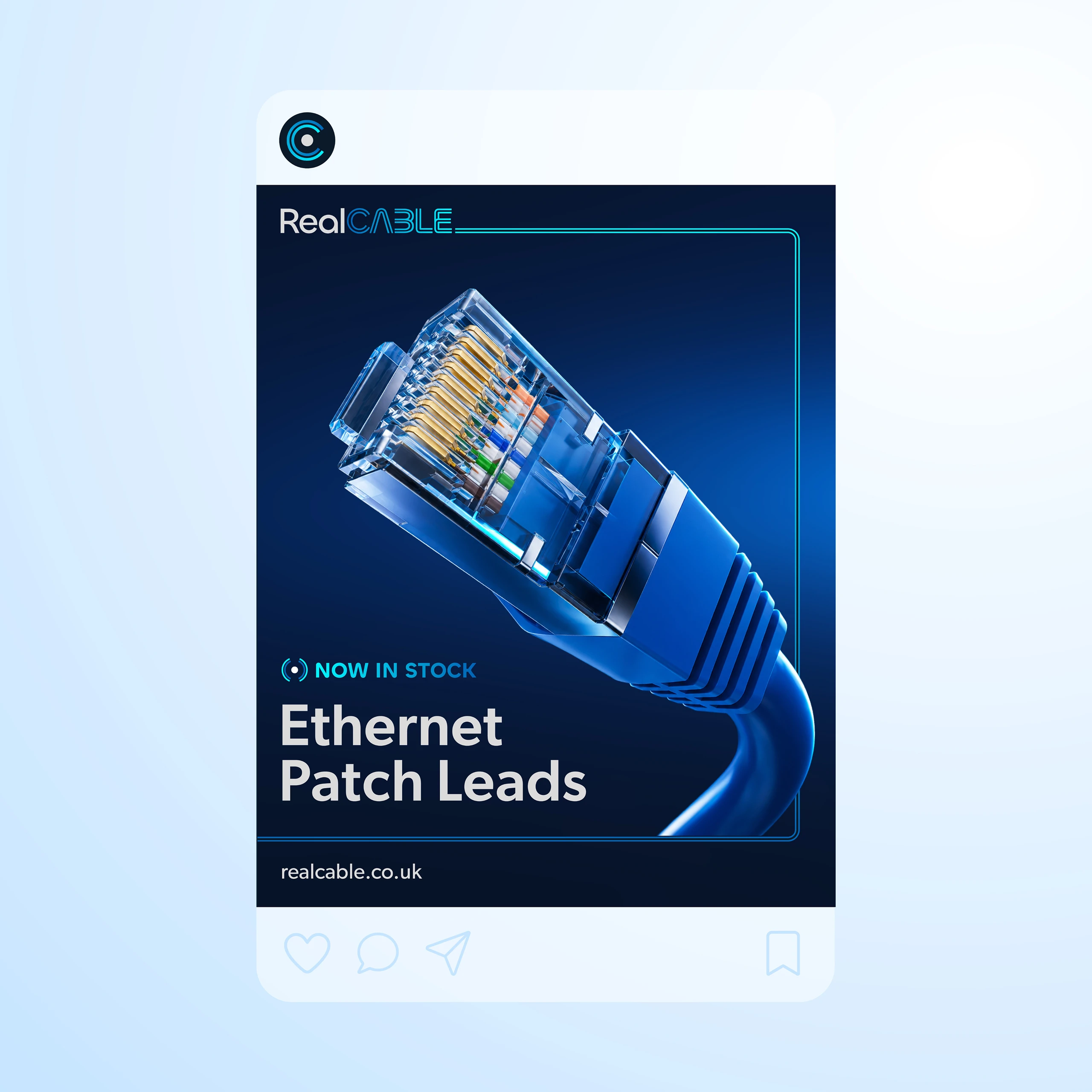
A new brand has no track record, so the first few weeks have to do a lot of convincing. We built a set of social templates for product launches and stock announcements, so a post in a feed clearly comes from the same company as the pack on the doorstep.

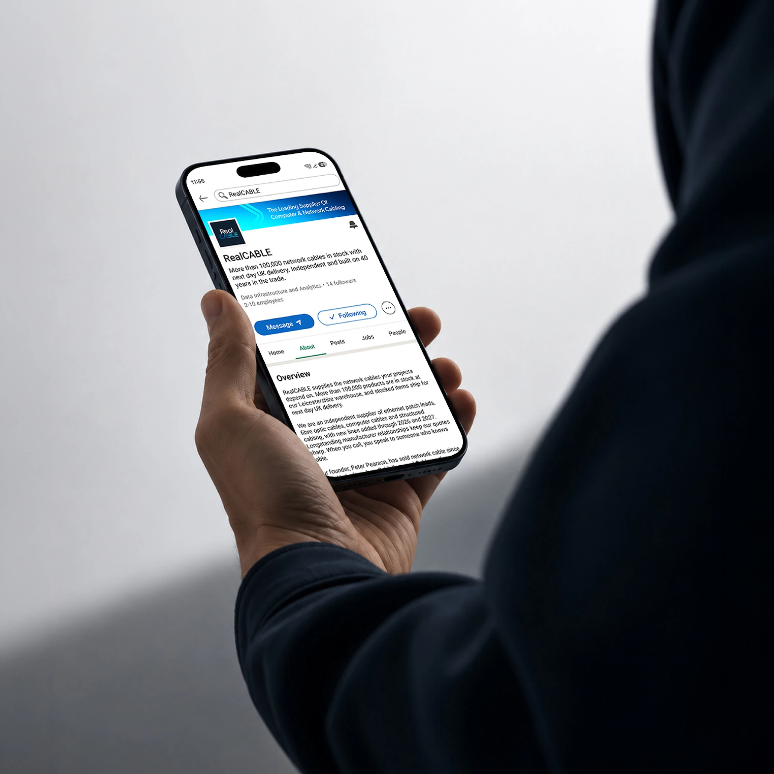
LinkedIn mattered most. It’s often the first place trades check before they call, so the page had to be ready on day one. We designed the banner and profile ad ensured it launched with some posts already out there, so nobody lands on the page and wonders whether the business is real.

Like what you see? We can help you bring your dream project to life.

Fill out the contact form and one of our team will get back to you within 24 hours.