For my entire design career I’ve only ever thought in pixels. It’s not something I’ve ever given any consideration because it just seemed like the only way to work. After all, my screen is made of pixels, my design programmes work in pixels, I just never thought about alternatives.
At least until I joined Twilo. Our developers here build everything in REM so I had to adapt and get used to a new way of working quickly, to avoid any speed bumps in the build process. At first it felt like an unusual way to work, but after a few projects it’s really started to make sense to me, designing in REM makes life easier for developers and allows us to create more flexible, accessible and scalable websites and platforms.
The Issue With Pixels
As a designer, pixels seem straight-forward, but the web isn’t a static place. People zoom, update accessibility settings and use sites on all kinds of devices. Pixels make it difficult to account for all of these possibilities which can result in text looking broken or illegible. My designs in Figma can look great on my screen but could be an absolute nightmare for our developers to build when they have to create multiple overrides and adjustments to account for inconsistent sizing or sizes that don’t translate well to specific situations.
The Benefits Of REM
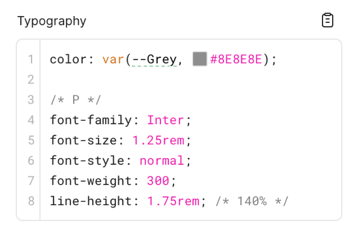
REM, or root em, solves a lot of our issues because it means that your sizes, be that fonts, margins, paddings, line heights, all scale from a root value which we can determine from the start, usually this number is 16px. This means 1rem = 16px, 1.5rem = 24px and so on. So for example, if a website is using accessibility features and a user scales up the font sizes to help them read, all the fonts will scale together proportionally. Or if our dev team need to make a global adjustment to sizing or spacing, they only need to update the size in 1 place and the entire website will fix itself, it results in much cleaner and consistent code, and a site that’s adaptable to the user’s needs.
My Process For Designing in REM
Since Figma doesn’t yet allow us to switch units from px to REM (at least not in design mode), I have to do things to old fashioned way with a conversion table. I’ve set up a table that converts px to REM but only displays values in increments of .25. This just means my designs are always free from awkward values like 2.0985rem, which is just annoying for developers when it could easily be a neat 2 REM.
I also find it handy to define a clear font scale, setting up a frame with all my font tags (h1, h2, h3 etc) and their corresponding line-heights (also in REM), just to give me a visual space to update the fonts across my entire document if I need to, this also helps our devs quickly reference all the fonts so they can set up their own style guide when they start a new web project.
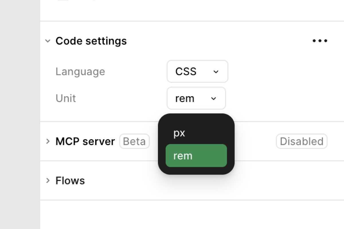
Something I also recently discovered is that Figma’s Dev Mode can actually convert your px values to REMs. If you enter Dev Mode, open the ‘Code Settings’ drop down and change the units from px to REM, all of the generated CSS for all your frames will now be displayed in REM units which can save your developers quite some time having to convert the px values in an external converter (or in their heads if they’re good at maths).
A Change in Mindset
I’ll be the first to admit I’ve never been the neatest designer and my designs have sometimes been a little sporadic and possibly didn’t follow a perfect order.
I was mostly concerned about the form over the function, if it looked good visually, I was happy with it. I’m now starting to see the beauty in the function too, having a clean, well-organised Figma file and a sizing structure that ensures all your button sizes are identical, your margins all match and your fonts are all consistent, leaves your final product looking much more polished, and makes for a happy dev team, too!