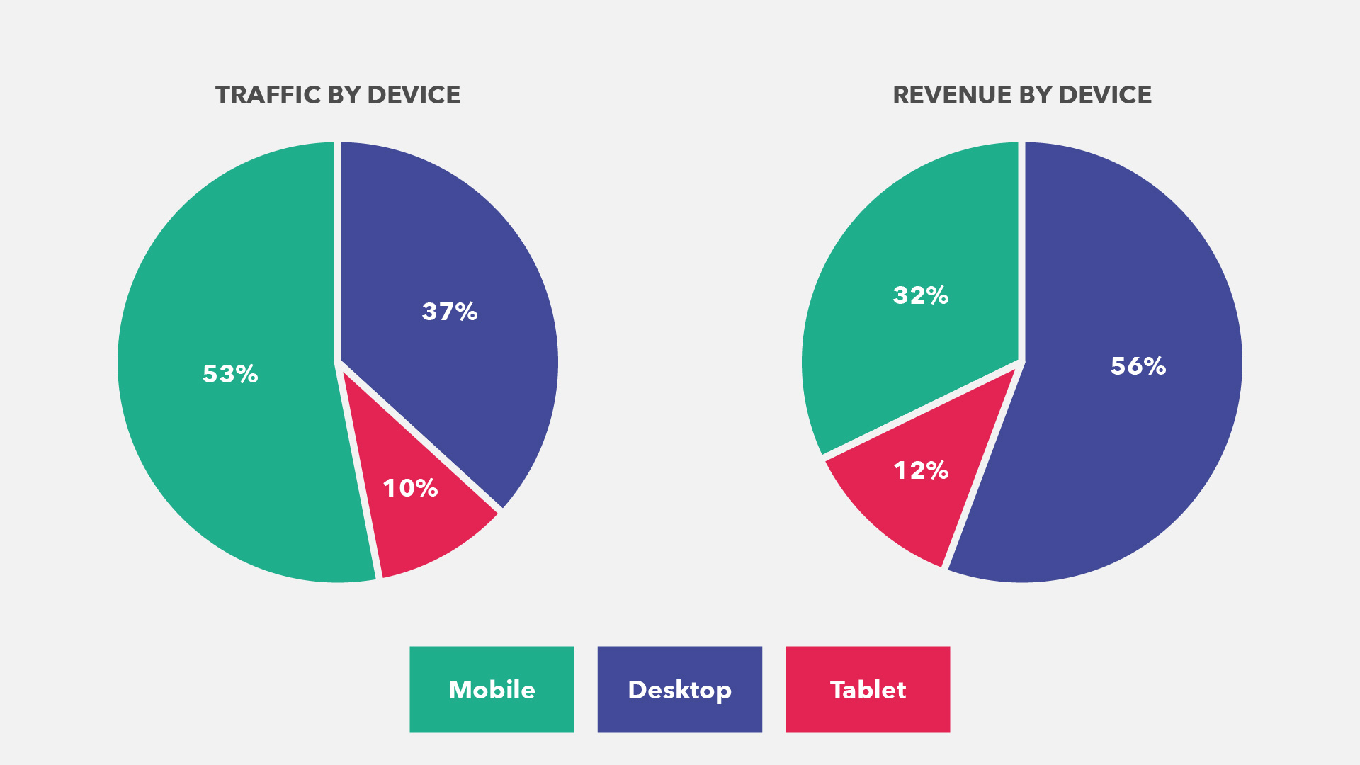
Mobile website traffic surpassed Desktop way back in 2016. Recent figures suggest around half the people browsing your website will be using a mobile device, compared to a third on desktop, and tablets making up the rest. You would think that with these figures most of your website sales would be coming from mobile devices, however this is not usually the case. Desktop is still the big winner when it comes to making conversions and selling products.
So why is that? What is preventing all those potential customers from following through with orders and purchasing on their mobiles?
Usability.
So many sites still treat mobile users as an afterthought, when the mobile version of your website should be treated as the most important aspect of your website. Sites that take forever to load on a 3G signal, hide navigation menus away in difficult to find places, and don’t include the latest time saving checkout features are making it too much of a chore for customers to complete purchases. Sure, they may switch to a desktop and return to complete, but that isn’t a risk you should be taking.
Here are 3 of the most important factors in creating a mobile user interface that’s great to use, and guaranteed ways to increase your mobile conversions.

1. Speed
This one may seem obvious, but it’s still the first major stumbling block for a lot of websites. It’s true that with 4G mobile browsing speeds have improved considerably, but 4G isn’t always available, and neither is a strong wifi connection. With ever increasing desktop screen resolutions, the gap between desktop and mobile sizes has become huge. Many website now feature massive 1920px wide image banners, which look fantastic on a HD monitor, but are completely wasted on a 375px wide mobile screen.
Where possible you should serve mobile specific images, created to look great on a small screen, but not burn all your data on download. This has the added benefit of creating banners that work better on a portrait mobile screen.
Mobile optimised images are definitely the most important factor in a fast mobile website, but you should also think about reducing server calls by combining scripts, and compressing all resources where possible, saving that extra 100kb will make a difference!

2. Mobile First Design
Don’t neglect your mobile users by giving them an inferior version of your desktop site. It’s often tempting to remove sections that don’t work as well on mobile, instead you should be creating specific mobile versions of that content, giving mobile users at least as good, if not better experiences than desktop.
Site navigation is key, for too long designers have relied on the hamburger menu, and hidden all their bulky navigation menus behind that little icon in the corner of the screen. It’s been proven that the hamburger menu will harm your sales, as it gives users no visual clues about what’s behind it, or where they are on your website. Instead try to think of 4 or 5 of the key areas of your website, and provide an always on screen tab menu for those areas, with sub menus when required. This allows users to see which area of your site they are in, and how to quickly switch to another.
Size is important. Modern design trends include using huge font sizes, which look great on desktop, but waste far too much space on a small mobile screen, and make the site seem unwieldy. While you should be reducing these large font sizes, you should also make sure all your forms and buttons are a sensible, usable size on mobile. Stick to the recommended minimum of 16px for all form inputs, and make sure all buttons are sausage-finger compatible.
3. Fast Checkout & Autocomplete
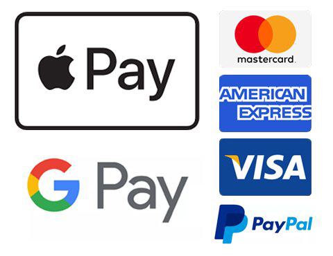
Filling out your billing address and shipping address and card details and etc etc… Tedious at the best of times, much more so on a little mobile keypad. This has to be the single biggest reason why mobile conversion rates suffer. Offer fast one-click checkouts like Paypal / Apple Pay / Google Pay wherever possible, and make it clear throughout your website that you do. Customers are used to using these payment methods, and seeing that you offer them will let them know they can easily complete their purchase on their phone.
Some customers will still want use a standard checkout form, so you should also make sure this is as streamlined as possible. Keep the required fields to an absolute minimum, and make sure all your form markup is correct, which will allow the mobile browser’s autocomplete to fill out the customers saved address details and card details.
In conclusion, treat your mobile users well, make it super easy for them to browse your products, and quick to checkout, and your mobile sales are sure to increase, and your website revenue will follow.