Feature Image Credit: pangrampangram.com
Early Development: Diverging Paths
In the past, serif and sans serif fonts had distinct roles: serifs for text and sans serifs for other purposes. A century ago, newspapers might of used ornate serif fonts like Century Expanded for text and geometric sans serifs like Franklin Gothic for headlines. The manufacturing options of these fonts reflected their intended uses, with Century Expanded lacking bold variants and Franklin Gothic offering bold options in various widths.
The advent of modernism, inspired by efficiency and simplicity, shifted design focus from ornate to clean, sleek lines. Graphic design became more about uniformity, geometry, and whitespace, emphasising practicality and usefulness.
In the early 21st century, sans serifs gained popularity for improved legibility on small digital screens with middling resolutions. However, advancements in screen resolution have rendered sans serifs unnecessary for clarity, allowing designers to experiment with typefaces and hybridisation.
New Directions
Modern brands aim to quickly engage audiences through appealing, accessible, and digestible messages, reflecting the influence of the internet and social media. As a result, simplicity, efficiency, and the ubiquitous use of sans serifs prevail. However, brands also seek to appear forward-thinking and edgy, leading to a trend of mixing sans and serif typefaces to create contrast and visual interest.
Guidelines For Effective Pairing
Contrast is a fundamental principle in visual design, creating typographic hierarchy to guide the reader’s attention. Pairing serifs and sans serifs establishes clear contrast both stylistically and emotionally, with serifs conveying maturity and sans serifs conveying modernity.
Choosing a leading font and considering similarities in shape can enhance unity and flow while maintaining contrast. Type hierarchy ties with contrast. It’s important to choose which of the two fonts will be the ‘leading’ font. Ideally, in a pairing, the two fonts shouldn’t compete against each other visually.
In some cases, again, not always, you would pair fonts with similar x-height, counter, and aperture. Using two ‘squarer’ or ’rounder’ fonts together can give a sense of unity and flow in the design while keeping that unique contrast between two typefaces.
Examples Of Current Trends
Regular Sans Serif With A Thin Modern Serif
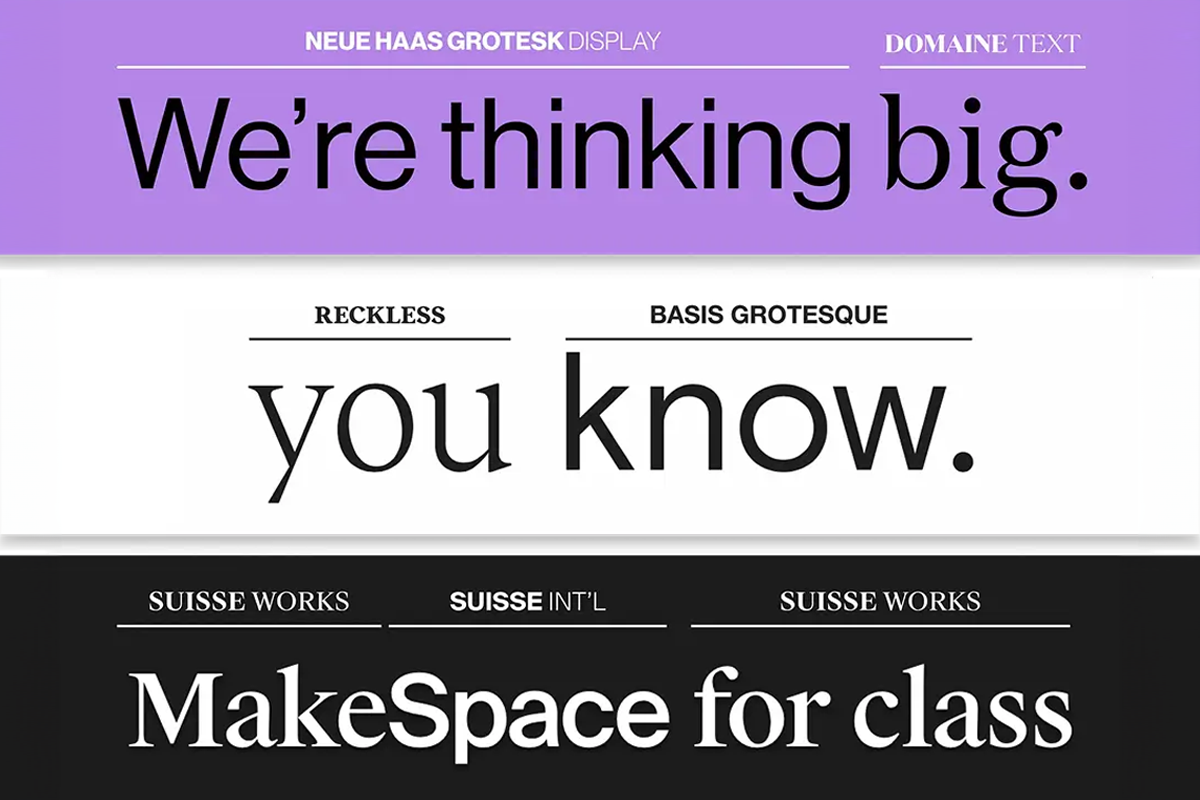
We hope to see a lot more of this font pairing trend this year – a regular sans serif paired with a thin modern serif. What’s great about this combination of typefaces is elegance and ease of readability. A modern serif isn’t always the most legible, but when used at a larger size with just a few words, it can create a distinct feel. The choice in the design below is exceptionally nice because of the interesting character of the typeface selected.
Oversized Serif and Sans Serif Pair
This pairing isn’t often used together but is simply beautiful. A current trend is the use of a large pairing with a serif and sans serif. What really makes this option work is layering the third line of smaller text that uses one of the typefaces from the oversized pair. This creates a nice layer effect with typography and allows you to use a minimal number of fonts in the process.
The thing to keep in mind with a serif-sans serif pair is that the difference between the typefaces is a design trick. Keep other text effects or tricks to a minimum when using this technique.
Finally, consider a modern serif with thick and thin strokes. It adds an extra level of elegance and pizazz to designs.

Conclusion
While established typefaces boast extensive families with meticulously coordinated styles, exceptional typography often thrives on unexpected combinations of disparate fonts. Like human dynamics, opposites can attract, so by pairing ‘introverted’ and ‘extroverted’ fonts it can create a harmonious balance. If you possess a standout font with a distinct ‘personality’ (commonly known as a display font), consider pairing it with a more subdued and traditional option for a well-rounded design.
Embrace daring choices, experiment freely, and trust your instincts. Sometimes, intuition will guide you towards combinations that defy conventional wisdom. Conversely, if a font pairing feels off, analyse why and use the experience to refine your approach.
The guidelines mentioned in this article and the current typography trends can be used as a springboard, adopting them if they serve your vision but never allowing them to stifle your creative exploration.