Since starting at Twilo in September this year, I have been on the constant lookout for ways to improve the set up of my design files — with the aim to make handover to the development team as smooth as possible. One big advantage of doing this is that it quickens the site builds process, as well as reducing the amount of inconsistencies between the design and the final website build. Recently, we have been exploring the benefits of Auto Layout and Dev Mode in Figma, and how they help improve the handover process between the design and development team.
The Introduction of Dev Mode
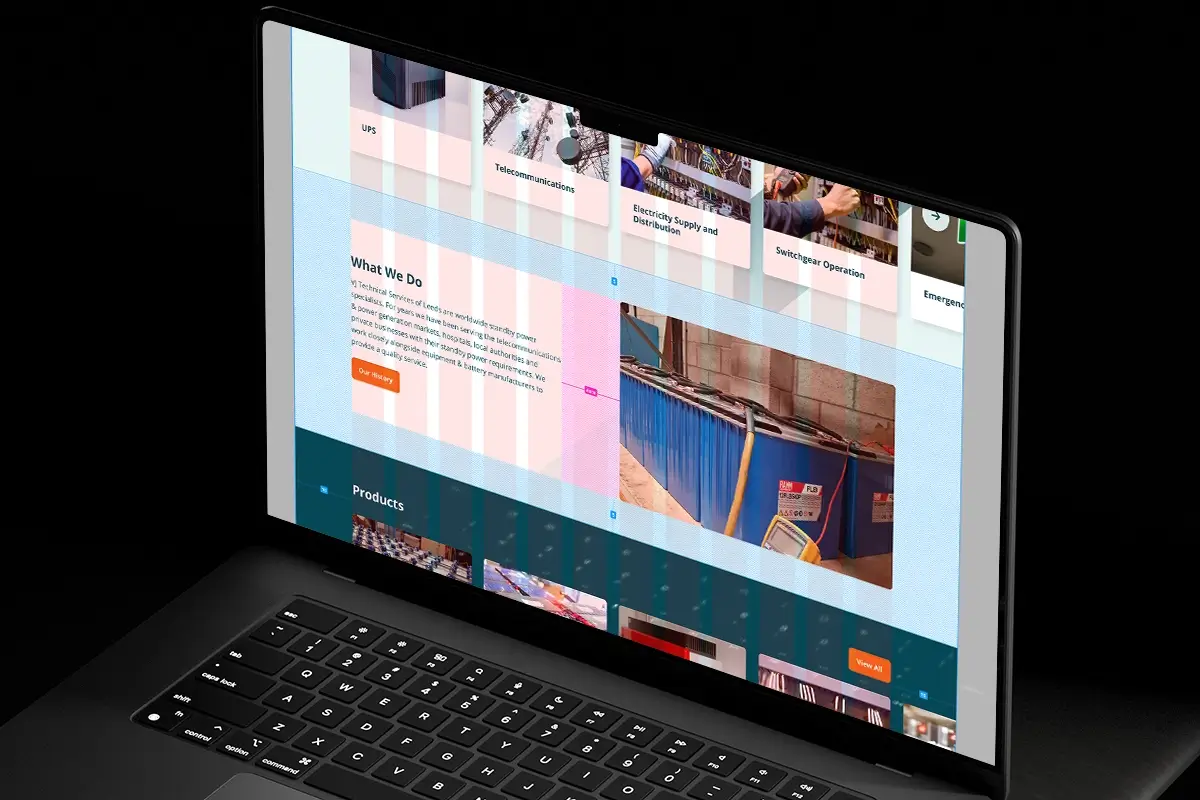
Figma is the software that we currently use to create website visuals. As well as being built for UI and Web Design, it also comes with some useful tools to help make the handover to the development team as smooth as possible.
Earlier in the year, Figma released a new mode within the design software that is tailored for developers, aptly named ‘Dev Mode’. Here, they can clearly identify spacing, colours and fonts within the design file, giving them a better overview of each element of the design. It even offers the capability to copy CSS code, which can make the transitioning from design to code that much quicker. The final result of utilising Dev Mode within Figma is a pixel-perfect adaptation of the design in the final build.
In order to make the most out of the Dev Mode feature, it is the designer’s responsibility to set up their files in a developer-friendly way. One way this can be achieved is by utilising Auto Layout in the design phase.
What is Auto Layout?
Auto Layout is a feature within Figma where designers can group elements together and apply spacing, padding and alignment in one fell swoop. This feature uses logic and numerical values to structure designs, and renders elements unmovable using the mouse or arrow keys — something us designers have been used to in the past. Although this sounds quite restrictive, Auto Layout encourages the designer to create more web-friendly designs by working with similar constraints to what a developer would be familiar with — ensuring each piece of the design fits together perfectly.
How do developers benefit from this?
When it comes to handing over files to the development team, designs created with Auto Layout are much clearer and consistent than those without. It’s impossible for elements to be misaligned by a pixel here and there, because Auto Layout deals with all of that.
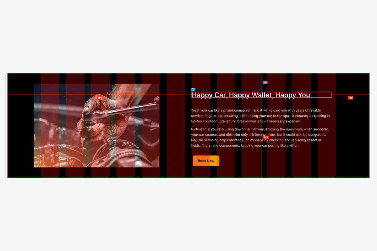
Take the example above — a Dev Mode screenshot from a design with no Auto Layout. Sizes can be defined in this view, but spacing between each element is unclear and, most glaringly, elements in the layout are slightly misaligned to the grid.
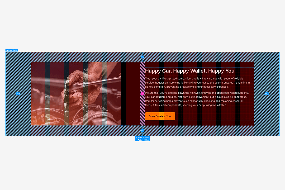
The example above has been made using Auto Layout, and straight away the structure is a lot more defined. At a glance, developers can see that there is 160px padding left and right, 64px padding top and bottom, and 32px gutter spacing. Clicking into each element will display any spacing and padding assigned to it. Best of all, the elements on the right-hand side are now perfectly aligned, and spaced together with intention. These subtle changes go a long way in communicating to the development team exactly how the layout needs to be structured.
Conclusion
Auto Layout is a powerful tool in Figma that helps structure and build designs that are perfectly aligned, consistent and more streamlined — resulting in smoother handover to the development team, and more accurate website builds. Initially, adapting to this feature can be difficult from a designer’s perspective. It forces them to trade freedom of movement for a more constrained approach, but taking the time to master Auto Layout can be a fruitful endeavour that is equally beneficial for both the design and development team.